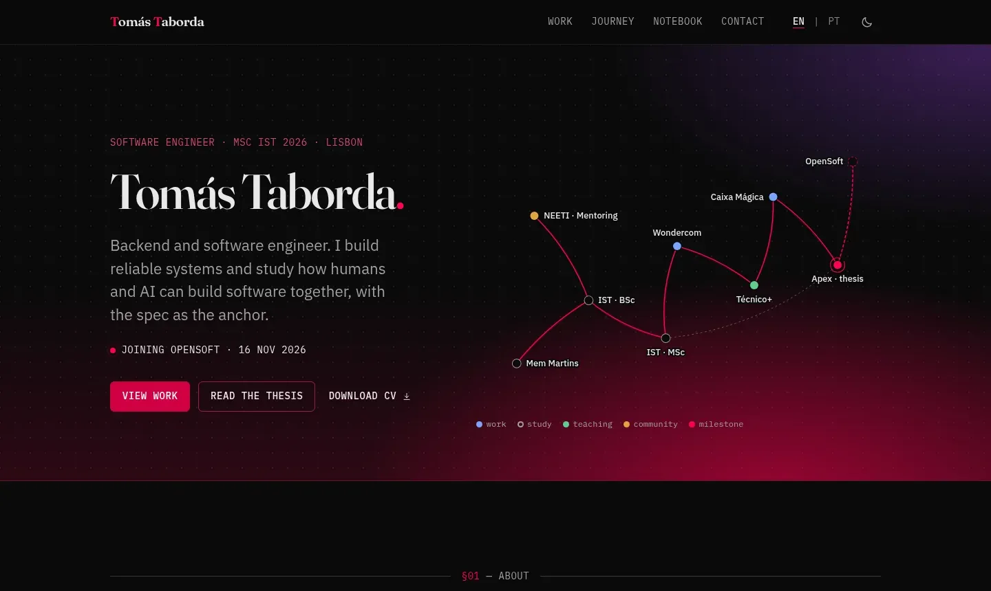
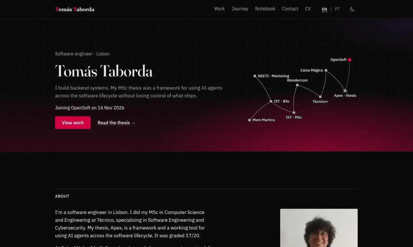
I designed the first version of this portfolio by hand. LinkedIn and AI-made portfolios were then getting a lot of exposure, so I overhauled the visuals with AI. The overhaul worked and the content was real, but the design was heavier than it needed to be. Every section opened with the same scaffold: a small uppercase kicker with a section number and a meta suffix, a serif slogan under it, then cards with coloured chips. The “engineering notebook” idea was there five times over: section marks, dimension lines, a taped photo with a tilt, margin notes and red-pen underlines. None of them read as a choice, because all of them were on at once.
The clean-up came from needing to scale that design back, because simpler is better. I did to it what my thesis argues you should do with AI in any phase of the work: write down what done means, let the agent do the work against it, and check the result with something other than the agent’s own opinion.
The brief
The starting point was a brief I wrote myself, with ideas from Reddit threads on what makes a generated UI recognisable and with Claude’s help on the wording. It was specific about outcomes and left the method open:
- one serif and one sans, with mono only for code, dates and spec values;
- one type ramp, one radius, one accent colour and two button styles;
- no reveal-on-scroll, shadows, tilts or emoji used as icons;
- plain copy, with a banned list of phrases the overhaul leaned on (“reliable systems”, “with the spec as the anchor”, “drawn to”, “along the way”);
- keep the things that were mine: the hero glow, the dot grid, the wordmark and the dusk photo on the contact page.
It also carried the rules that apply to everything on this site: no phone number or address, and nothing invented. If a fact could not be checked, it became a visible TODO or was left out.
The pipeline
I ran it in Claude Code with three skills installed, and Claude wrote a handful of scripts for the checks.
Impeccable, before and after
Impeccable is a design skill with a critique command, an audit command and a rule-based detector for common generated-UI patterns. The critique before any change scored the site 27/40 on Nielsen’s heuristics, with a 1/4 on aesthetic and minimalist design. Its detector found 9 problems on the built pages, including 37 em dashes on the Apex page alone, numbered section markers on every section, a type hierarchy where the small sizes were 12, 14.4 and 15.2 px, and a callout with a coloured side stripe.
After the pass, the audit scored 19/20. Updating Impeccable from 3.9 to 4.8 near the end was worth it: the new version renders each page at desktop and mobile widths and found problems the first one could not see, such as chart labels around 9 px, chart years at 3.2:1 contrast over the hero glow on mobile, and logo tiles with no padding. All of those are fixed. The one finding left was the cream page background, which I kept at that point.
Humanizer for the copy
humanizer rewrites text that reads as generated: “not X but Y” contrasts, one-line closers, forced lists of three, dashes everywhere, bold labels used as decoration. It ran over every visible string in English and Portuguese. The UI strings and most data files needed nothing by then. The posts and the Apex page data did: it removed several “rather than” contrasts, a closing paragraph that repeated the opening of a post, and closers such as “Confidence is not evidence” that restated the sentence before them. The rule I cared about most was that it keeps facts and adds none. The dissertation abstract and the thesis statement stayed verbatim.
frontend-design as a second opinion
The frontend-design skill lists the traits generated pages cluster around right now. Two of them applied to this site: the warm off-white background with a serif display, and uppercase section labels with · meta lines. The brief set both, so they stayed at first; a later critique pushed me to drop the uppercase labels and, in the end, the warm background too. Everything else on that list (one-word headline accents, numbered markers, entrance animations on every section, card shadows) is gone.
Measured checks
The part I would keep for any project is the verification. Claude wrote small Playwright scripts that measured the built site:
- a metrics script that reads the computed style of every visible text element on 7 pages, at 2 widths and in 2 themes, and reports font families, type sizes, radii, uppercase count, accent uses per screen and contrast failures;
- 27 function checks: theme toggle, language switch, filters, copy buttons, the mobile menu’s focus trap, no horizontal scroll;
- a link checker over every built page and every external link;
- Lighthouse on 8 pages, mobile and desktop.
The result, measured: 7 type sizes (14, 16, 17, 20, 28, 40 and 56 px), radii of 4 px and a pill, at most 2 accent uses per screen, not counting the wordmark, 0 contrast failures, 0 broken internal links, and Lighthouse performance between 98 and 100 with 100 everywhere else. Before and after screenshots of 6 pages, at 2 widths and in 2 themes, are in the repository next to a report that maps each line of the brief to its evidence.
Where my judgement still mattered
Some decisions stayed with me.
- The brief asked for a short list in the home Experience section. Once I saw it live, it was a boring list next to an Education timeline with logos, so Experience now uses the same timeline.
- The brief kept the hero glow as brand. Later I toned its violet down to a faint corner, because on a dark screen it was the loudest thing on the page.
- The detector flagged the cream background. I kept it for a while because I liked it, knowing it is one of the most common generated defaults, then replaced it with a neutral off-white and re-checked the colour pairs.
- Two steps ran degraded and the report says so: the humanizer install was blocked the first time, so the first copy pass applied its rules by hand, and the before-critique ran in one context where Impeccable asks for two independent assessments.
A second round
On 5 November I ran the same three skills over the site again. The critique scored 20/32, which can’t be compared with the earlier 27/40: the method differed and two heuristics did not apply. The screenshots above show the end of the first pass, so they no longer match the site in every detail.
Most of what came out of it was structural or small:
- Work moved up the home page, with the Apex diagram, and the Apex page got a section bar and a shorter head.
- Uppercase section labels became sans headings, and the cream background became a neutral off-white.
- The contact form got a request timeout, announced errors and a visible focus state.
- The phase strip, commit graph and heatmap became reachable by keyboard, and standalone links reached a 24 px target.
- The humanizer pass found copy that was correct but thin. The thesis appeared in nearly the same sentence three times on the home page, and the Outfolio card never said what Outfolio is.
Two of the fixes came from me looking at the deployed site. Arrows were still on some links, so I asked for plain text everywhere. The work cards were unbalanced, with empty space on the projects without screenshots, and the Apex card differed between the home and work pages. Now there is one Apex card and the project cards are equal and text-only.
The larger finding was the Apex ledger, a hand-built page that the first pass had never measured. It had its own violet accent, heading font and theme toggle, 31 uppercase elements and no Portuguese version. The detector reported 55 findings there and 0 on the main pages. My own rescore of the audit, from axe, the detector and the screenshots, came to 15/20 against the earlier 19/20, partly because it now counted that page.
I had Claude rebuild the ledger inside the site’s design, in both languages, and then ran everything again. Lighthouse found a layout shift of 0.177 on the Portuguese home page on phones, caused by a font arriving late. Preloading it fixed that. The same check showed three font files that every page downloaded and no page used, so those went too, which then widened every paragraph, because the browser had been measuring ch from one of them. The detector caught that with 22 line-length findings, and the text width went back to what it was.
The final run: Lighthouse on 11 pages, mobile and desktop, scored 99 to 100 on performance and 100 on everything else. The detector reports 0 findings on the built pages at both widths, axe is clean on 12 pages at 2 widths in 2 themes, and the metrics script reads 7 type sizes and 0 uppercase elements, leaving out chart labels inside SVGs. My rescore of the audit is 19/20. A new critique, run by a separate Claude agent that had not seen the earlier scores or the detector output, gave 24/32. Its main point matches the audit point I held back: serif and crimson on off-white is still a familiar look, and the path tracing, the site’s one original idea, did not reach phones. So I took that up after the critique: the path now runs down the phone hero and along the Experience and Education timelines in crimson, and the pink wash in light mode is almost gone. That gives up the limit of 2 accent uses per screen from the first pass, on purpose.
What I would reuse
Write the brief as a list of checkable outcomes. Give the agent skills that encode taste, so it is not inventing a design language from scratch. Then measure the result with scripts, on every page, and keep the evidence in the repository. The same agent did the overhaul and most of the clean-up; the second time it had a brief and checks to answer to.